Covens Cave
Graphic Design
Overview
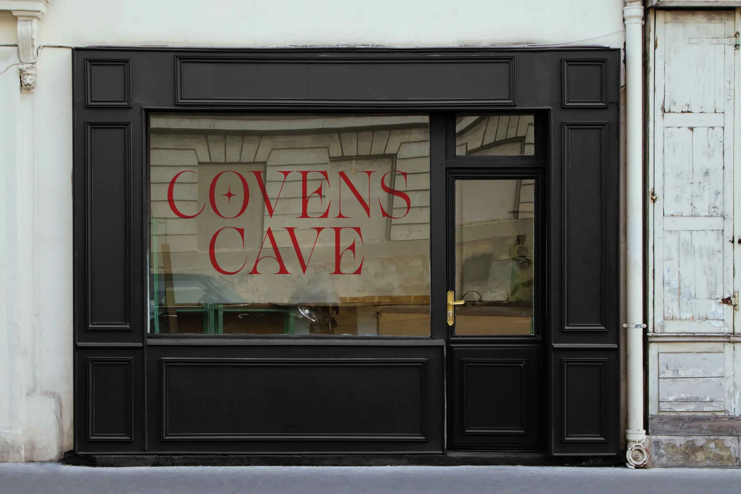
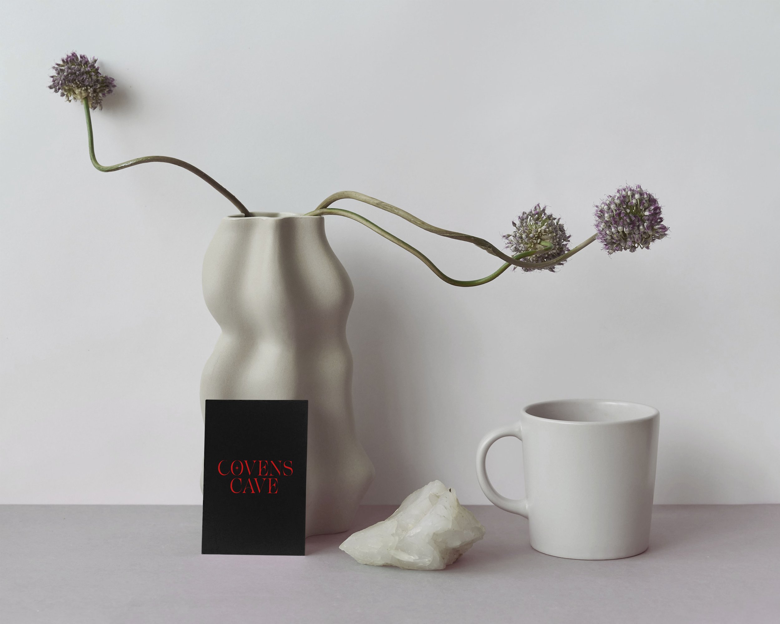
The "Covens Cave" nail salon logo features an elegant serif typeface with a mystical and sophisticated touch. The distinct design element—a star incorporated into the letter "O"—adds a magical or occult-inspired aesthetic. The sharp yet refined letterforms create a sense of mystery, aligning with themes of witchcraft, spirituality, or esoteric branding. The black-and-white colour scheme enhances the timeless and minimalistic appeal, making it suitable for a brand that values both tradition and modern elegance.
Client
Covens Cave
Year
2024
Tools used
Photoshop, Illustrator
Case Study